How to Design an iOS 26 App Icon Using Icon Composer
With iOS 26, Apple introduced a new visual language, Liquid Glass and a powerful tool to match: Icon Composer. In this guide, we show you how we used it to redesign FitWoody’s icon from scratch, and how you can use it to create translucent, layered icons that feel alive in the system.

When Apple introduced Icon Composer alongside iOS 26, they didn’t just release a tool, they signaled a shift in how app icons are meant to feel. With the rise of Liquid Glass, Apple’s new design language built around translucency, depth, and materiality, icons can no longer be static graphics. They’re expected to behave like physical objects. They should reflect, refract, glow, and breathe.
In this article, I’ll walk you through how we used Icon Composer to redesign the icon for FitWoody 2.0, our fitness app, and adapt it to Apple’s new system aesthetic, without using 3D software or complicated pipelines.
Even if you’re not a visual designer (I’m not one either), Icon Composer makes it surprisingly intuitive to create icons that look and feel like part of the iOS 26 ecosystem.
What is Icon Composer?
Icon Composer is a new developer tool introduced by Apple in 2024. It’s available as a standalone app in the Additional Tools section of the developer portal.
Unlike traditional workflows where you simulate depth using drop shadows and blurs, Icon Composer allows you to build true visual depth. You create multi-layered icons with real transparency, lighting effects, and even optical behaviors like refraction.
Why We Rebuilt the FitWoody Icon with Icon Composer
When we opened the waitlist for FitWoody 2.0, we weren’t just launching a new version of our fitness app, we were reshaping its identity from the ground up. Designed specifically for iOS 26, this release introduces:
- A completely new UI built on Apple’s Liquid Glass design language
- Adaptive training plans powered by Foundation Models
- A shift in mindset: from punishment to consistency, from pressure to care
It wouldn’t have made sense to redesign the product while leaving the icon behind. Our previous icon was fine: flat, minimal, and easy to recognize. But in the new context, it felt out of place like a leftover from a previous era visually disconnected from the new environment.
We didn’t just want a nicer icon. We wanted one that behaved like part of the system that responded to light, depth, and motion the way the rest of iOS 26 does.
That’s when we turned to Icon Composer. And everything changed.
Step-by-Step: Creating an iOS 26 App Icon Using Icon Composer
Here’s how we rebuilt the FitWoody icon using Icon Composer, from Figma to final asset.
1. Break Your Design into Physical Layers
Start by thinking in real depth. In our case, the icon included:
- A flame symbol (base, core, glow)
- Tiny eyes
- Subtle reflections and particles
- Grid
We exported each element as:
- SVG for clean precision, crisp shapes (like the flame base)
- Transparent PNGs for nuances: blurry glows, highlights, and soft effects
Pro tip: Don’t include rounded corners. Icon Composer handles shape masks automatically.
2. Install Icon Composer
You can download Icon Composer from Apple’s Additional Tools page (requires a developer account). It runs on macOS Sequoia and up.
Once you open it, you’ll see a minimalist interface: a blank canvas, layer manager, and a few key controls. It’s designed to stay out of your way and let you focus on structure and behavior.
3. Import and Organize Your Layers
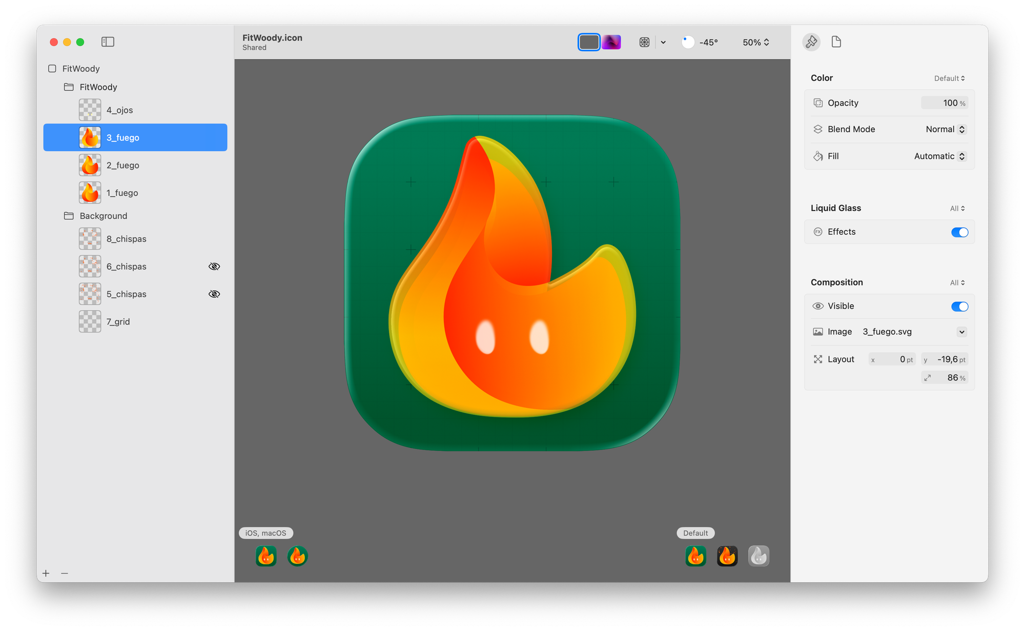
Drag each exported layer into the canvas. Then, organize them into up to four depth groups:
- Group 1: Flame
- Group 2: Details
- Group 3: Highlights and particles
- Group 4: Grid
Each group defines how far a layer sits behind or in front of the “glass” front plane. This is crucial to achieve the illusion of physical depth.
4. Enable Liquid Glass Effects
Select the layers you want to give volume and activate Liquid Glass mode.
This unlocks advanced visual behaviors:
- Blur for ambient softness
- Opacity for layering glow
- Specular highlights for light bounce
- Refraction to distort background layers
- Shadowing to create depth cues
In our case, we added refraction to the flame and specular sparkle to the particles, resulting in an icon that felt like it was floating inside a piece of glass.
You don’t need to understand 3D just think like a lighting designer.
5. Preview in All System Modes
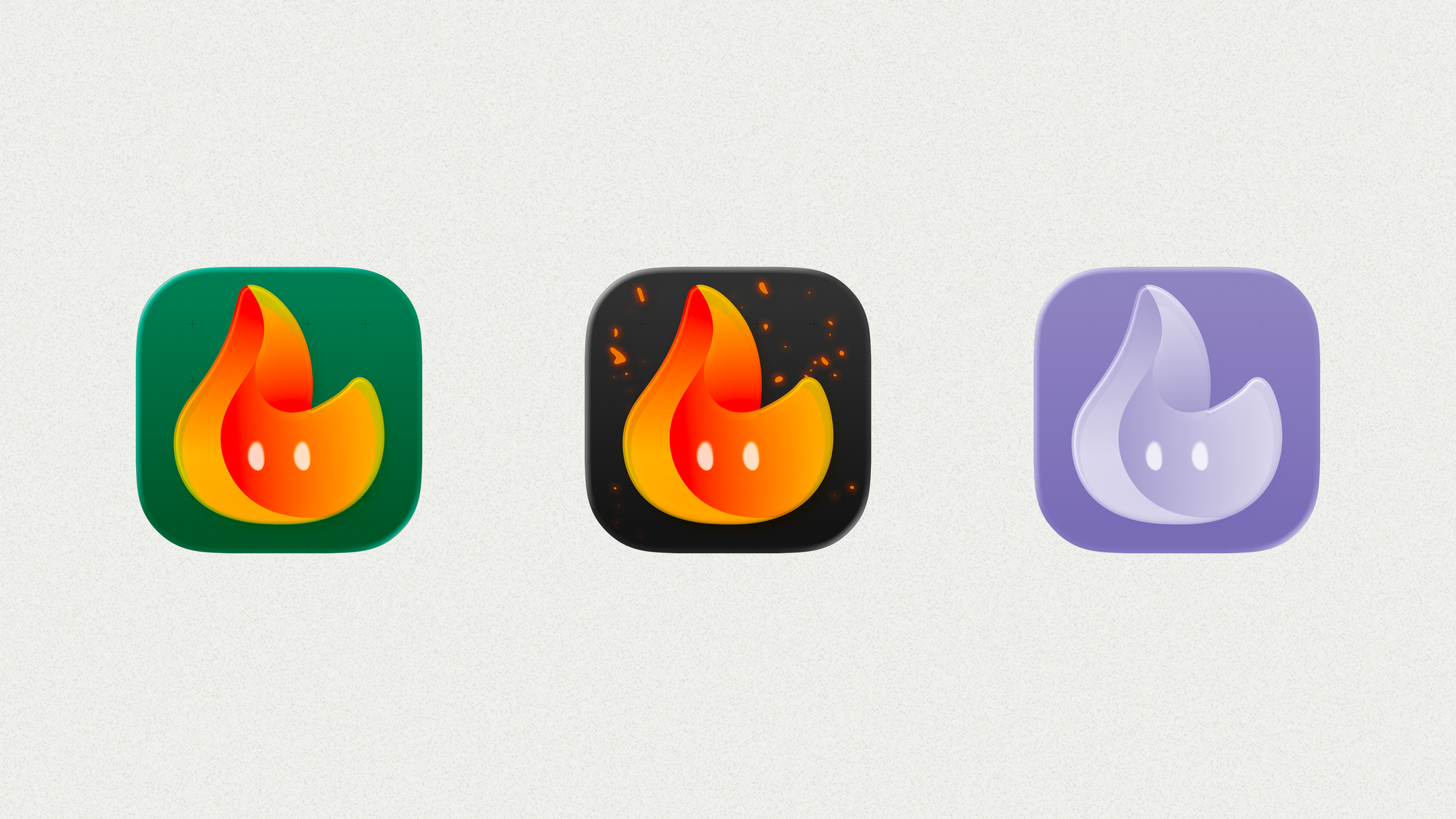
These previews are more than just a checklist. What feels vibrant in light mode can quickly look muddy or oversaturated in dark mode if you’re not intentional. We spent time fine-tuning glow, contrast, and opacity until the icon felt alive and legible in every variation.
For dark mode, we went a step further.
We imagined FitWoody being used at night — during late recovery sessions, quiet evening walks, or when checking your energy just before bed. So instead of just dimming the icon, we gave it a little soul: embers.
The background darkens, but the flame stays bright, surrounded by subtle, animated sparks that feel warm, alive, and comforting.
It’s a small detail, but it reinforces what FitWoody stands for: energy that stays with you, even on low days, late hours, or dark screens.
This kind of contextual thinking is exactly what Icon Composer makes possible.
6. Export and Integrate with Xcode
Once your icon looks good across modes, export the .icon file.
This can be dropped directly into Xcode no need to create separate resolution variants.
Icon Composer generates:
- All necessary AppIcon sets for iOS, iPadOS, and watchOS
- .icon files for Xcode compatibility
- Special support for Liquid Glass rendering on macOS 26+
Tips for Creating Your Own Liquid Glass Icon
- Think in foreground/midground/background planes
- Use SVG for sharp shapes and PNG for effects
- Don’t overdo the refraction it can get distracting
- Skip 3D tools; just focus on light, transparency, and blur
- Preview in all three system modes before exporting
- Keep your icon recognizable even with advanced effects
Final Thoughts: Why Icon Composer Matters
Apple’s introduction of Icon Composer and Liquid Glass isn’t just about looks.
It’s a shift toward designing icons as living objects, elements that react, adapt, and speak the same language as the system.
Tools like Icon Composer let you step into that world without needing a background in 3D or motion graphics. And for designers like me who never loved making icons it’s honestly a game-changer.
FitWoody 2.0 now feels at home in iOS 26. It all started by looking at our icon, and seeing glass, not pixels.
If you’re curious, you can check out FitWoody or sign up for the beta, we’re building in public, and we’d love your feedback.