Vision Pro: Design Beyond Limits… Or Not Quite Yet
Magic at first sight. Friction after months. Vision Pro surrounds you, yet still makes you play by its rules. Why are we still designing for boxes?

When bandwidth is no longer the problem, new questions arise.
Not so long ago, designing for technology meant defining boundaries.
We translated commands into buttons. We organized screens into neat blocks. We created interfaces so everyday people could talk to machines without needing to speak their language.
In a way, design was the bridge that transformed technical logic into human language.
But today, that bridge looks very different. AI has blown up many of those barriers. It lets us interact in ways that felt like science fiction just a few years ago. Vision Pro, in many ways, is the child of this new era.
That first moment: pure magic
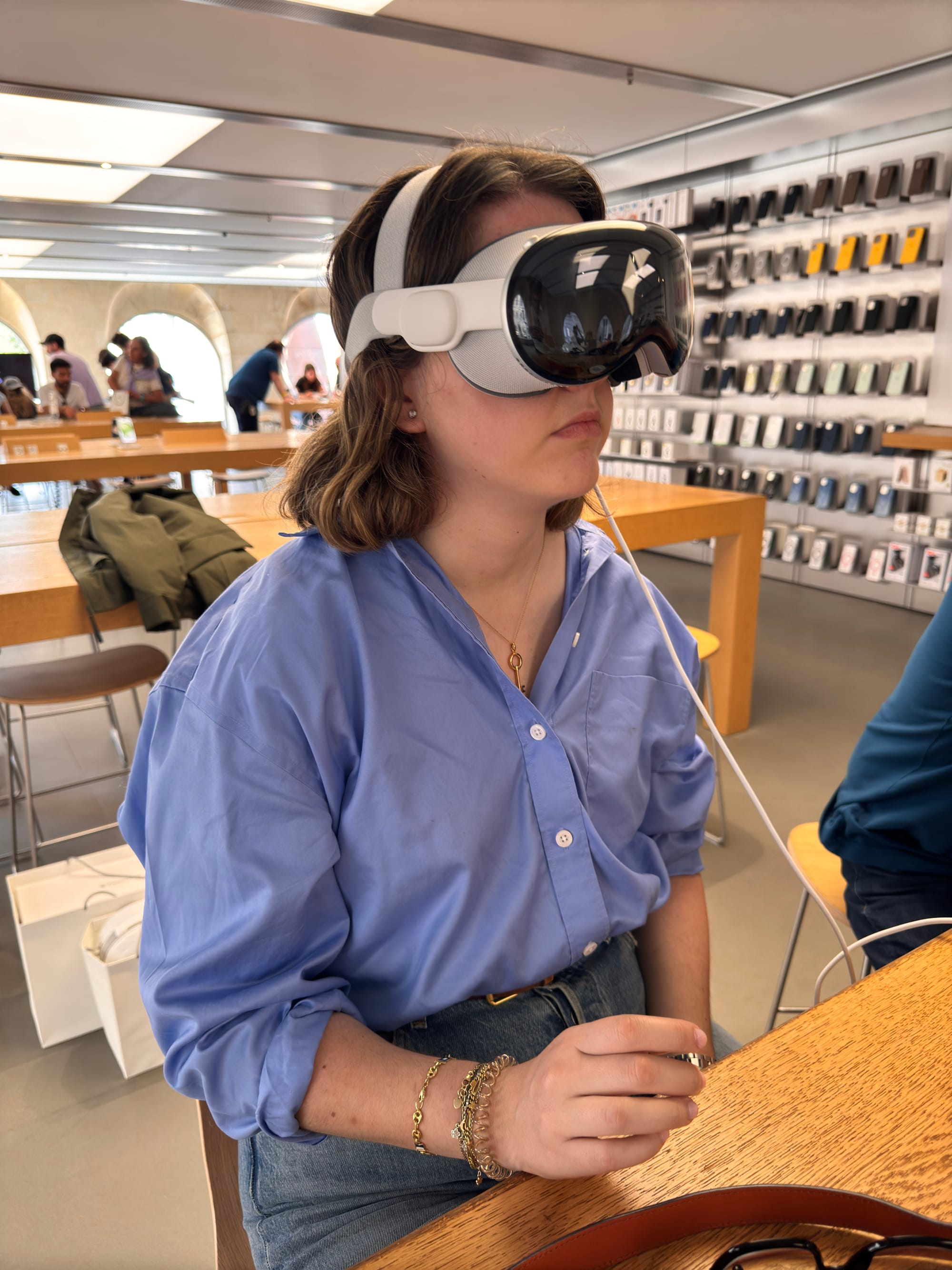
It’s hard to describe what happens when you first put them on.
You’re surrounded by the interface. It fills the space. There are no rigid boxes anymore. You become the screen. The space becomes the screen.
At first, everything feels seamless. Your gaze activates elements. Your voice guides the flow. It’s hypnotic, much like that first time you touched an iPhone and gestures became the interface.
But once the fascination wears off, reality kicks in.
The old command line, now in high definition
Why, if we can already talk to technology as naturally as we talk to each other, are we still designing as if interfaces were carved in stone?
This is where the magic fades a little.
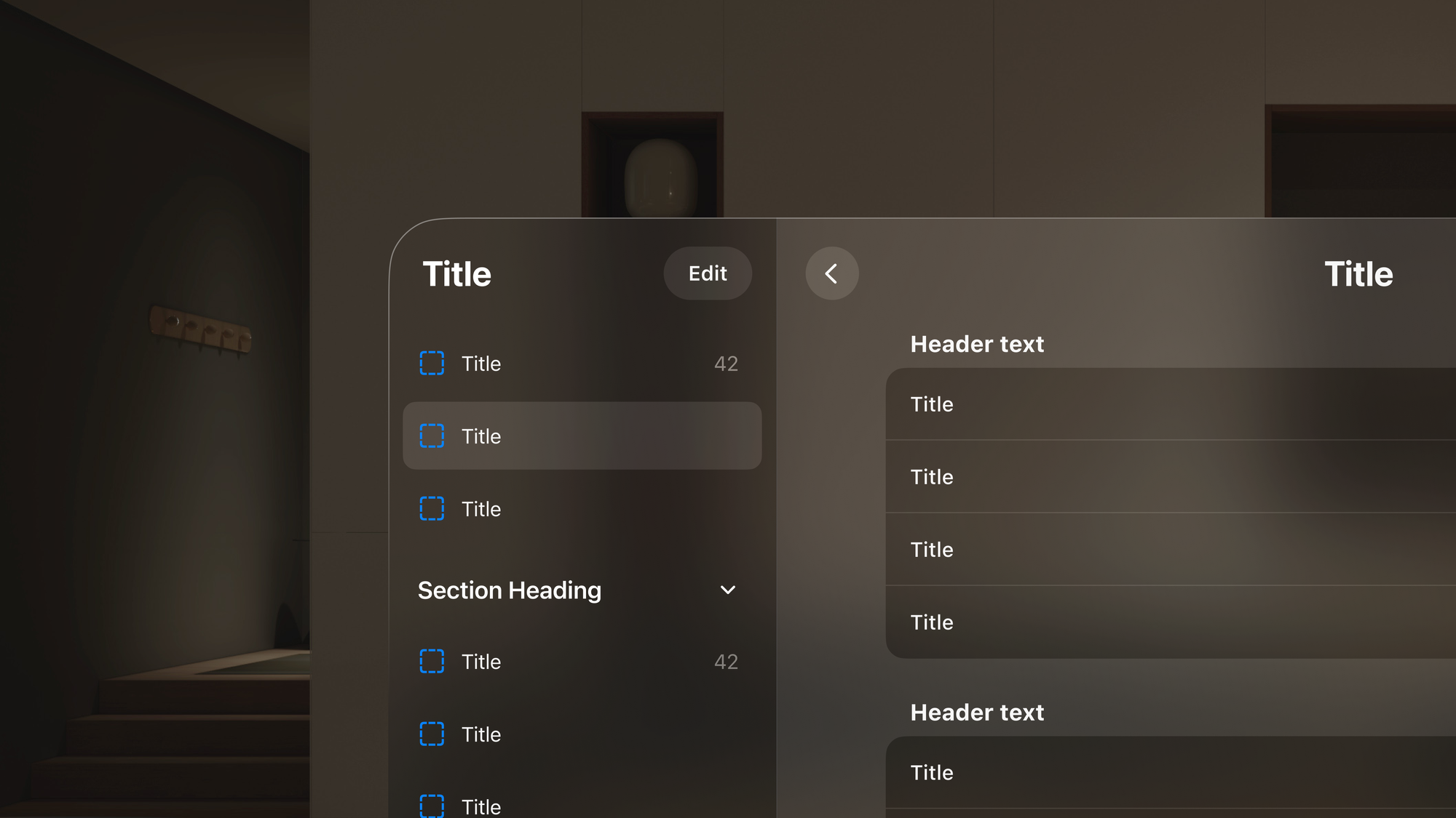
Vision Pro is brilliant, yes, but also rigid.
Its potential is enormous, yet its patterns remain inherited. You still select options within a square. You still structure experiences like you would on a sophisticated tablet… except now you’re viewing everything through a digital window.
It’s not entirely natural. Not yet truly human.
The friction is still there, quietly hiding beneath layers of awe.
A year of living with Vision Pro: from wonder to friction
My relationship with Vision Pro has gone through phases.
I still remember that wild Friday when we drove to Bordeaux after work, chasing a dream and hoping to grab the very first units as they hit stores in France.
What happened next felt like something out of a movie. I hadn’t spoken French since I was sixteen. Somehow, after a couple of clumsy calls, we found ourselves being welcomed like rock stars. No exaggeration, they treated us like we were building the future right there and then. They even did Asier’s demo in Spanish. I couldn’t believe it. It was wild, strange, and absolutely unforgettable.
That surreal trip marked the beginning of what would later become part of my daily life with them.
But now, almost a year later, what remains?
The same limits every device eventually shows. The promise of a “total interface” still feels… partial. Using it for long periods is exhausting. And the interaction? It’s mostly about selecting and validating, just like always. Somehow, we’re still stuck with old patterns, even when everything around us suggests we should have moved on.
Designing for Vision Pro: building on shaky ground
Right now, I’m deep into designing our first project for Vision Pro.
It’s an exciting, frustrating challenge.
Asier, who leads the technical side, is performing miracles with tools that barely exist yet. But when it comes to design, our creative playground feels oddly small. Everything still fits into a fixed space. Into boxes users must manually activate.
Inside revolutionary hardware, we are still designing like it’s 2010.
This troubles me. I keep asking myself why we can’t — or aren’t allowed to — design with the user’s real-world experience in mind. Their fatigue, their voice, their way of naturally interacting.
Vision Pro is the future… but not quite the present
Lately, I keep going back to something Javier Cañada said during a Vostok class last year at Instituto Tramontana:
“The oldest interface in history is language.”
And yet, we are still forcing people to learn patterns that aren’t theirs.
Vision Pro is a fantastic first step into a new kind of relationship between humans and technology. A prototype full of potential that lets us dream and imagine what’s next.
But right now, here and today, it still feels like a command line dressed up as magic.
Patricia Bedoya
Co-founder and Design Lead at Chubby Apps