When Health Has to Fit Into a Glance
Sometimes the smallest spaces reveal the most, a glance, a signal, a rhythm to follow.

I don’t know why, but when I think about these new widgets, my mind always goes back to an ordinary morning: coffee in hand, the Apple Watch buzzing, my wrist lifting almost on autopilot. And there it was, one of the first prototypes. Tiny, almost shy, as if it were asking for permission to exist. And yet it said something about me… before I did anything at all.
That small moment made it clear that designing for these spaces wasn’t going to be simple.
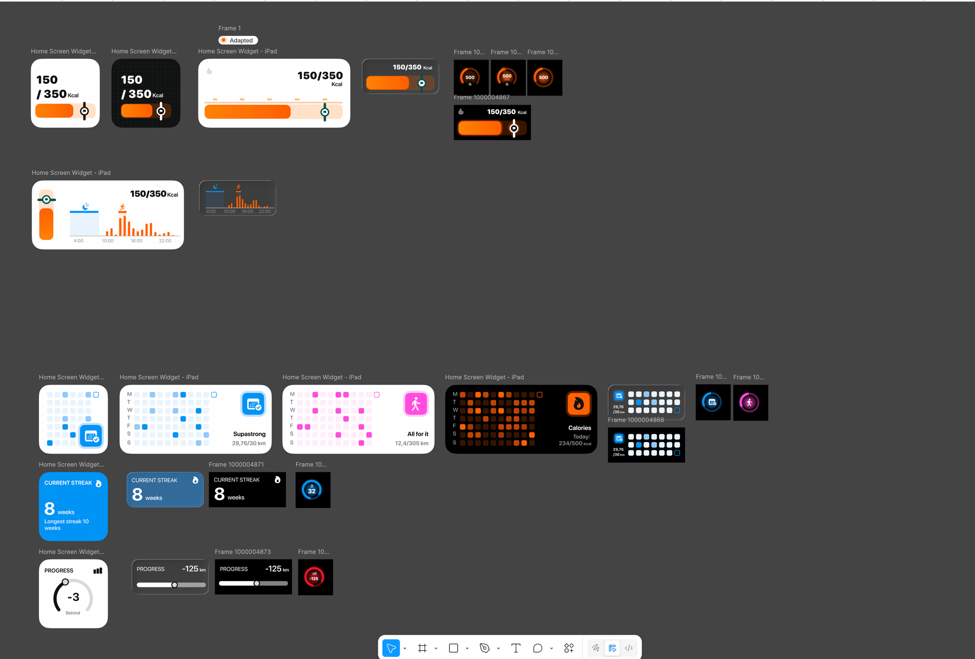
Designing for the iPhone has rules. But designing for the Lock Screen, the Smart Stack, the Apple Watch complications, especially the microscopic ones, is a completely different kind of challenge. You design for instants. For microseconds of attention. For the moments when life briefly looks your way.
And in that lack of control, you have to decide what truth can fit into two centimeters of space.
Health is complex. Motivation is complex. And yet a widget can’t show complexity; it can only suggest it. It can only offer a gesture. That’s why these first widgets focus on movement and long-term goals: because they’re the parts that can live without knowing everything about you. Even so, they still had to feel human. They still had to be honest.

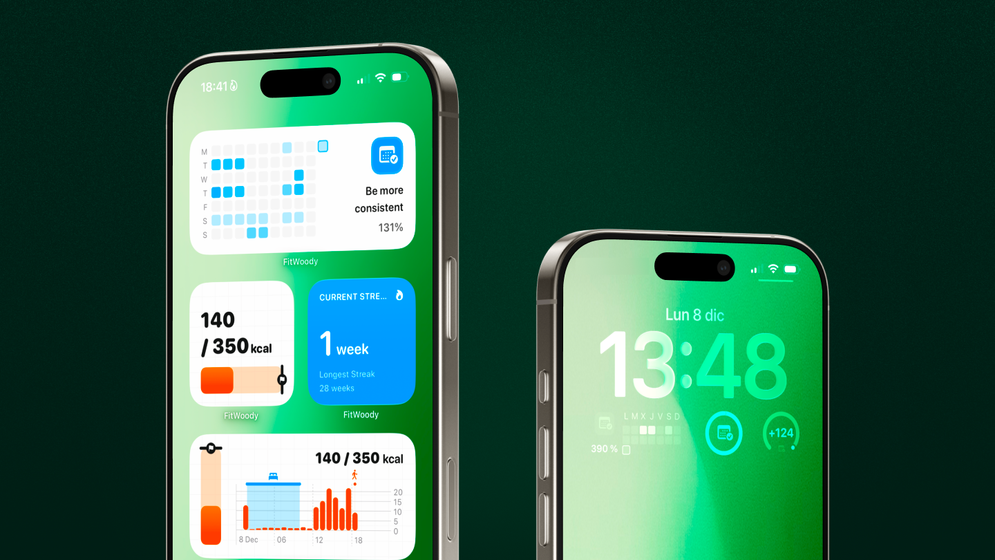
A small blue grid can say more about your month than any chart. A tiny number on your wrist can remind you of an intention you’ve been trying to recover. But the thing that struck me most is something simple: a widget doesn’t speak when you search for it; it speaks when it appears. And that makes it deeply emotional.
But the most important, and the hardest, part is still ahead.
Because real health doesn’t begin with your steps, or your calories, or even your consistency. It begins with your rest. With how you wake up. With how your energy shifts throughout the day.
The next widgets will be about sleep. And once they arrive, FitWoody will be able to adjust hour by hour to how you feel, not just what you do. It will be able to say: you can push a bit more today or you don’t need to force anything today. It will finally be able to accompany you, not just inform you.
All of this work, the technical limits, the frustrations, the attempts, has been training for the moment we get there: to a system that understands your day isn’t linear, that your body changes, that your energy breathes.
Because in the end, designing health isn’t about designing screens.
It’s about designing how we flow through the day.