When Systems End, Feeling Begins
FitPassport reimagines how we see our health: not as charts, but as something we can feel. A digital passport where data becomes personal, textured, and alive. A reminder that when design stops chasing perfection, it starts touching emotion.
There was a moment when design felt like an engineering problem. We built systems, grids, tokens, and libraries to tame chaos, to make design scalable, predictable, efficient. We created order.
And it worked.
For a while, everything looked clean and balanced. But the irony of systems is that, when they succeed, they erase difference. Every app became interchangeable. Every gesture felt familiar. Every surface was smooth, but emotionless. It’s easy to blame trends, but I think the truth runs deeper. We were building those systems not just for us, but for what came next.
The logic, the rules, the predictability, that’s exactly what AI understands. It’s the kind of design that can be automated, multiplied, optimized to perfection.
So maybe systems were never meant to be our legacy. Maybe they were our gift to the machines.
Design systems belong to AI
AI is built for consistency. It understands the grid, it loves the rule, it thrives in the predictable. It will inherit the systems we’ve built and make them even better: faster, sharper, more consistent than we ever could.
But humans? We’re not consistent. We’re not scalable. We’re not precise. We’re emotional. That’s our territory.
The feeling that something is slightly off, but right. The warmth that comes from a color that breaks the palette. The joy of an animation that feels more like breathing than code. Those are the moments that make design human.
That’s what we tried to capture in FitPassport.
The birth of FitPassport
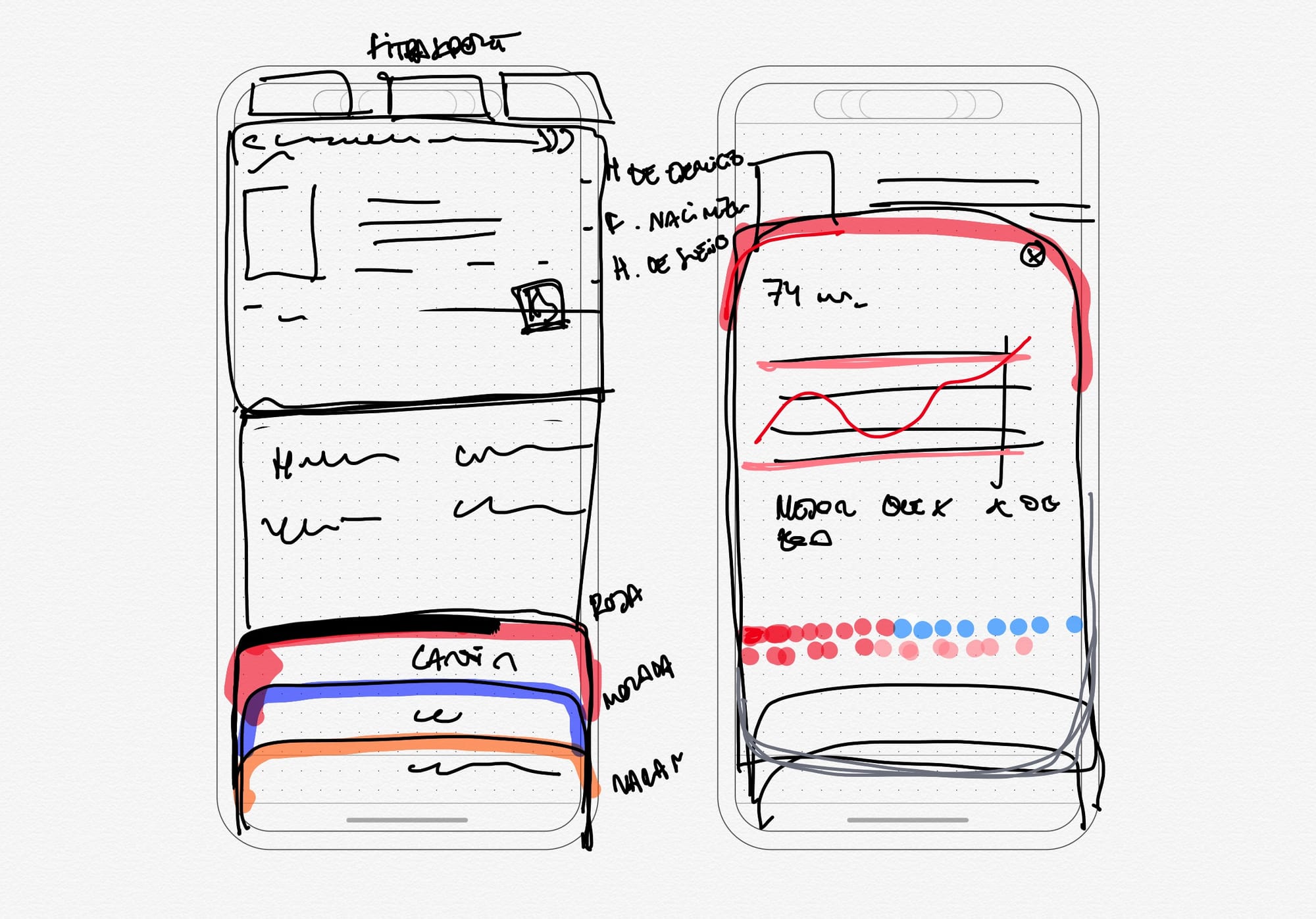
The idea came from a simple question: what if your health didn’t look like a dashboard? What if it looked like a memory?
We wanted a way to show your long-term progress not as data, but as a story. A visual record of your resilience; your sleep, your training, your recovery, all condensed into something you’d actually want to open.
That’s how the metaphor of the passport appeared.
A collection of pages that tell who you are through time. Stamped not with borders, but with effort. And so FitPassport became a kind of digital artifact: crafted, textured, emotional.
Materiality in a digital world
This is the first time we’ve worked fully inside the new iOS 26 design language, what Apple calls Liquid Glass. It’s a system obsessed with materiality: with depth, translucency, and light that behaves like matter.
We took that philosophy and pushed it further. In FitPassport, surfaces feel physical. Layers overlap like sheets of polished glass. The shadows and highlights move subtly as you scroll.
We wanted data to feel alive, not drawn.
And beneath all that, there’s a guilloché pattern: that intricate web of lines you usually find in passports or banknotes. We used it as a visual metaphor for authenticity. In the analog world, guilloché patterns protect against forgery. In ours, they protect meaning. They remind you that behind the data, there’s something personal: something that belongs only to you.
The beauty of imperfection
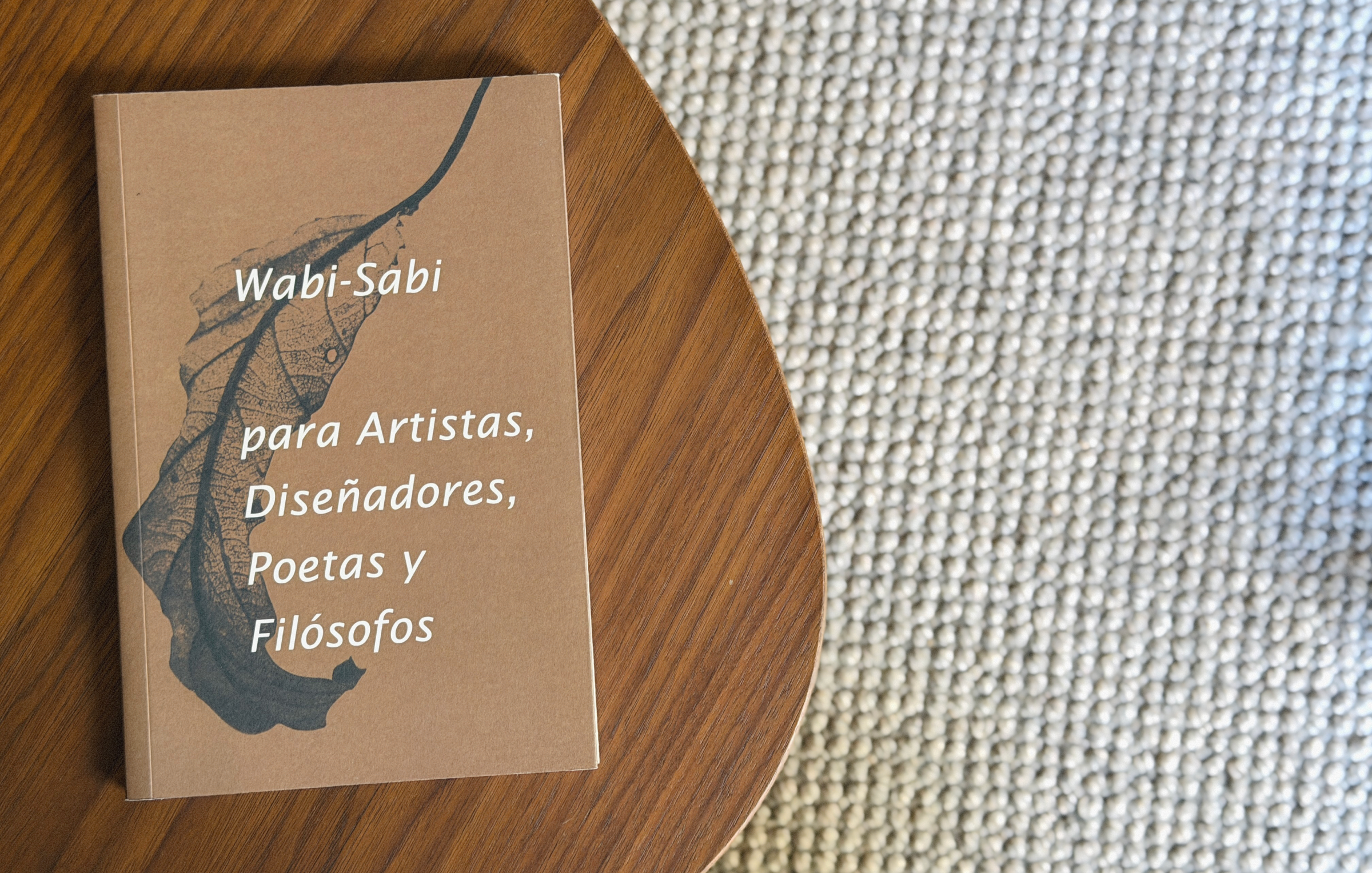
When I look at FitPassport, I think a lot about wabi-sabi, the Japanese idea that beauty lives in imperfection: in things that grow, fade, and change.
Our health is like that. It’s never stable, never finished, never perfect. It evolves. Some days you feel strong. Others you rest. Over time, what matters is the texture that remains: the small asymmetries that tell your story.
That’s why we didn’t want the interface to feel rigid. It moves softly, it glows unevenly, it carries its own rhythm. Because perfection is for systems. Life is for everything that slips through them.
From visual to spoken
The next shift in design will be even more invisible. Interfaces are becoming spoken. We’re already talking to our devices, asking, not tapping.
The more natural it gets, the less we’ll see. And that’s a beautiful thing: frictionless, human, effortless. But there’s still value in what can be seen. In what’s made to be shown.
FitPassport lives in that space: the space between spoken efficiency and visible pride. Because sometimes, you don’t just want to know how you’re doing: you want to see it.
You want to open something that says, “This is me. This is what I’ve built.”
The future: from function to feeling
As AI takes over the precision of systems, we’ll return to the parts that can’t be measured. To the warmth of texture. To the irregularity of light. To the quiet pleasure of something that feels made, not generated.
Because when everything becomes predictable, emotion becomes the rebellion. When everything is frictionless, expression becomes the truth.
And when systems end, feeling begins.
