
Designing Websites for iPhone Duo: How We Made Our Framer Sites Go Edge to Edge
iPhone Duo puts a strip of Safari controls beside your page. How to make any Framer website go edge to edge, what Safari paints there, and a free skill.

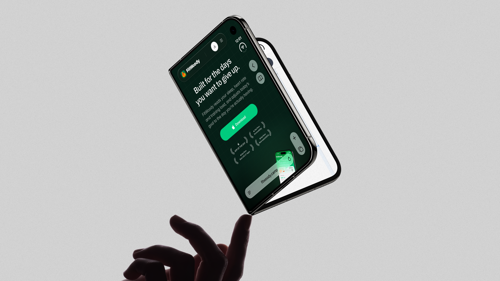
iPhone Duo ships at the end of October. Asier and I opened our Framer sites in the simulator expecting to nod and move on, and Safari had other plans: a strip of controls down the right side, and our pages stopping dead against it. This is what we learned fixing it, written so you can do the same on any Framer site: what Safari really paints there, the code that goes in Framer, how to set up the simulator, the mistakes to skip, and a free skill that does it for you.
viewport-fit=cover, safe-area insets and theme-color do nothing. Safari shows real page content in that strip only when the document is wider than the viewport and the viewport meta has initial-scale=1. So you hang one extra column off the body, lock sideways panning with touch-action, and rebuild the page background inside it. In Framer it is one script in Custom Code, End of <body> tag.The question that would not leave me alone
Still buying but this vertical system bar isn't it 🥴 pic.twitter.com/icnc9NATJy
— Regy (@regyperlera) September 19, 2026
We build iPhone apps. FitWoody is ours, and we build them for clients too. So when Apple announced iPhone Duo, the first conversation in the studio was about apps, and that is a story for another article.
This one is about something smaller, and honestly, more annoying.
We have a problem with polish. We cannot leave it alone. While everyone was busy thinking about apps, a question kept nagging at me: how will our websites look on it?
So one Sunday afternoon in September I opened fitwoody.camp and chubby.studio, both built in Framer, in the iPhone Duo simulator.
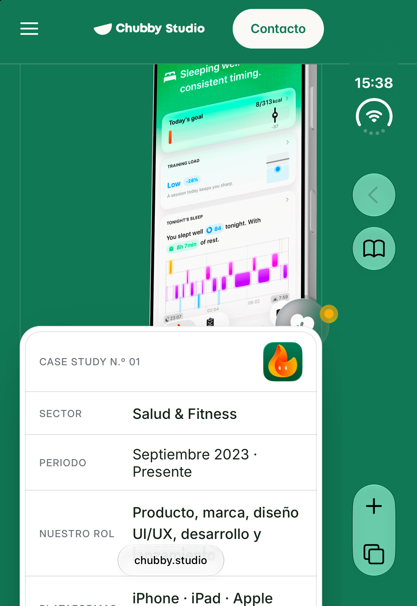
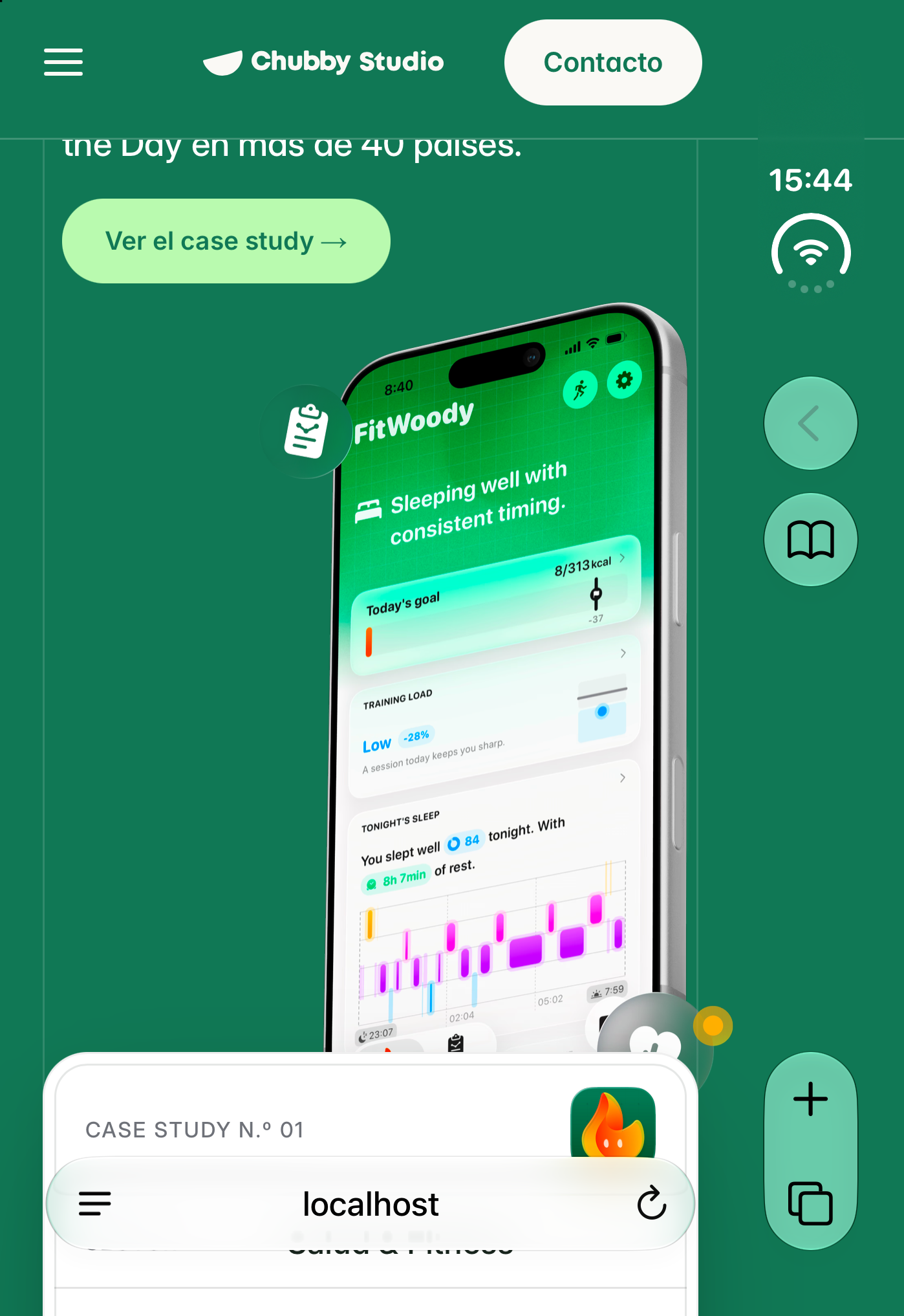
On the right side of the screen, Safari keeps a vertical strip with the clock, the back button and the tabs. Our hero looked great right up to that strip. Dark green, a faint grid, a soft glow behind the phone. And then, flat colour. The grid stops. The glow is cut with a knife.
Nothing was broken. Everything worked. It just stopped feeling like one surface and started feeling like a website inside a frame.
"Nothing was broken. It just stopped feeling like one surface."
I am not a web engineer, and I did not want a hack that falls over on the next iOS release. So we did the boring thing first. We measured.
Before anything else: an iPhone Duo on your Mac
Nobody has the device yet, and you do not need it. Everything in this article was done in the simulator, on a Mac, with free tools.
What you need. A Mac, Xcode, and the iOS 27.1 simulator. That last bit matters more than it sounds: the iPhone Duo only exists in the iOS 27.1 simulator. We had iOS 27.0 installed too, and the Duo is simply not in its list of devices. Until iOS 27.1 ships alongside the device, that means the beta Xcode that comes with it. We used Xcode 27.1 on macOS 26.6.
- Download Xcode from developer.apple.com/download with your Apple ID. You do not need a paid developer account. Drag it into Applications.
- Add the iOS 27.1 simulator. Open Xcode once, go to its Settings and find the section that lists the simulators you can download (Components in recent versions, Platforms in older ones). Plan for disk space: Xcode is around 4 GB, and each iOS simulator several more.
- Open Device Hub. In Xcode 27 the old Simulator app is gone; simulators live in Device Hub, which ships inside Xcode (
/Applications/Xcode.app/Contents/Applications/DeviceHub.app). Create an iPhone Duo there with iOS 27.1, or in one line from the terminal:
xcrun simctl create "iPhone Duo" com.apple.CoreSimulator.SimDeviceType.iPhone-Duo com.apple.CoreSimulator.SimRuntime.iOS-27-1
- Boot it and open your site.
xcrun simctl boot "iPhone Duo"
open /Applications/Xcode.app/Contents/Applications/DeviceHub.app
xcrun simctl openurl booted https://your-site.com
- Test before you publish. The simulator reaches your Mac's
localhostwith no setup, so you can save a copy of your published page, change it, serve it withpython3 -m http.server 8765and openhttp://localhost:8765/in the simulator. That is how we tested every version without touching the live site. - Look inside the page. In Safari on your Mac, turn on Settings, Advanced, "Show features for web developers". The Develop menu then lists the simulator and the page open in it, with the full Web Inspector.
If you have several Xcodes, point the command line at the right one with sudo xcode-select -s /Applications/Xcode-beta.app, or simctl will not see the Duo. And if your screenshots come out black: the Duo simulator has more than one display. xcrun simctl io booted enumerate lists them; pass the port UUID of the one marked Display class: 0 with --display=.
What Safari on iPhone Duo actually paints
The reference for this kind of problem is still WebKit's article on designing websites for iPhone X: viewport-fit=cover, env(safe-area-inset-*) and a good theme-color. I tried all three in the first ten minutes. Not one pixel changed.
So we changed method. Tiny control pages, one change per page, served from the Mac and opened in the simulator. It felt slow. It was the fastest thing we did all week.
| What we tried | What happened in the strip |
|---|---|
viewport-fit=cover |
Nothing. Every env(safe-area-inset-*) stays at 0 |
theme-color |
Nothing |
background-color on the body |
It tints the strip. Flat |
background-image on the body |
It never arrives |
A position: fixed element hanging past the right edge |
It never arrives |
A document wider than the viewport, with initial-scale=1 |
The strip shows that real part of the document |
The same without initial-scale=1 |
Safari widens the viewport and shrinks the whole page |
overflow-x: hidden on html |
You can still drag the page sideways |
touch-action: pan-y pinch-zoom |
You cannot |
That sixth row is the whole article.
The web view is as wide as the screen, 466 points. The layout viewport is 382. The strip covers the 84 points in between. It is not opaque chrome. It is glass sitting on top of your document. If your document ends at 382, Safari has nothing to show there but the body colour. If it keeps going, Safari shows it.
And a small gift: screen.width - innerWidth is the width of the strip. On every other iPhone it is 0, which is exactly the switch you need.
Where the code goes in Framer
My first instinct, as a designer, was to fix it on the canvas. You cannot. Framer wraps every page in a container with overflow: clip, so nothing you design can spill past the viewport.
What Framer does give you is Custom Code: Site Settings, General, Custom Code, End of <body> tag. The whole fix is one <script> block pasted there. It runs on every page and survives Framer's client-side navigation if it listens to pushState and replaceState.
Two Framer details that cost us time:
- The first child of
#mainis a<style>tag, not your page. The page wrapper is the firstdivwith children. - A full-page background grid is often an absolutely positioned child of that wrapper, not part of a section. Test by navigating through your own menu, not only by reloading, or you will miss it.
And if you edit custom code through Framer's API: writing a slot replaces the whole slot. Read it first and write your cookie banner back along with the new script.
None of this is Framer only. The script runs on plain HTML or Webflow too. Framer is where we learned it.
Short on time? Everything below is packed as a free skill for Claude, script included. It is at the end.
The recipe, for any site
1. Only act when there is a strip
On a normal iPhone, a Mac or Android, the script must do nothing at all. We checked that as carefully as the feature itself: the worst outcome would be fixing a device nobody has yet and breaking the ones everybody has.
function bandWidth() {
  if (!/iPhone/.test(navigator.userAgent) || navigator.maxTouchPoints < 2) return 0;
  var gap = Math.round(screen.width - window.innerWidth);
  return gap >= 40 && gap <= 200 ? gap : 0;
}
2. Make the document wider, safely
Three things together, or you trade one problem for another.
var meta = document.querySelector('meta[name="viewport"]');
meta.setAttribute("content", "width=device-width, initial-scale=1");

document.documentElement.style.overflowX = "hidden";
document.documentElement.style.touchAction = "pan-y pinch-zoom";
document.body.style.touchAction = "pan-y pinch-zoom";

var edge = document.createElement("div");
edge.setAttribute("aria-hidden", "true");
edge.style.cssText = "position:absolute;top:0;left:100%;width:" + band + "px;" +
  "height:" + pageHeight + "px;overflow:clip;pointer-events:none";
document.body.appendChild(edge);
The column starts exactly where the viewport ends and hangs from the body, outside Framer's clipped wrapper. Because it is part of the document, it scrolls natively. No scroll listeners, no wobble during momentum. Give horizontal panning back while the user is zoomed in; people who zoom need to move around.
3. Rebuild the background, section by section
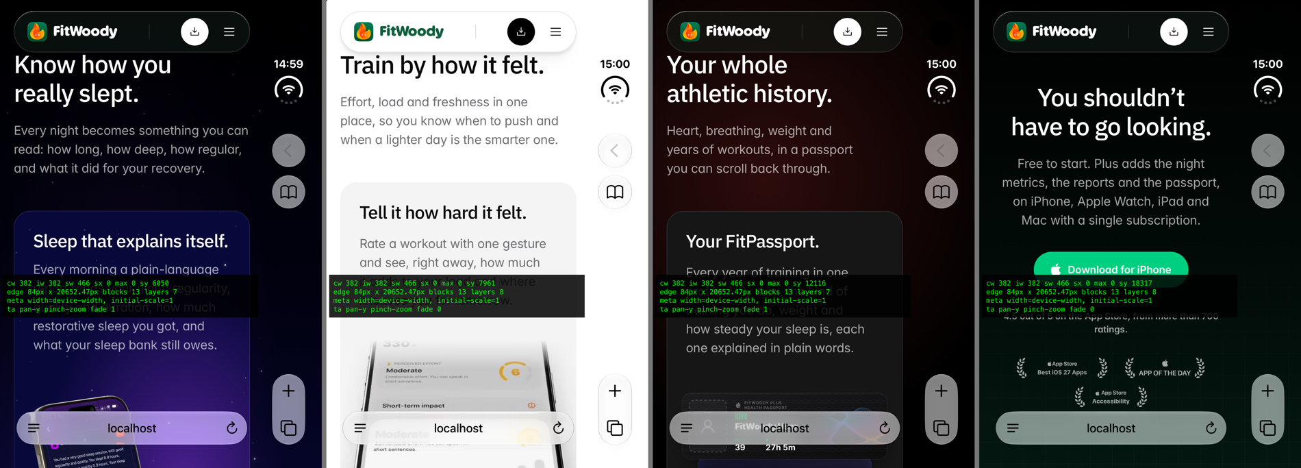
We do not clone the page. We read it. For each section, one absolutely positioned piece at the same height, with what is safe to copy: the background colour, or a vertical gradient, which looks identical at any width.
var r = section.getBoundingClientRect(), cs = getComputedStyle(section);
var piece = document.createElement("div");
piece.style.cssText = "position:absolute;left:0;width:100%;top:" + (r.top + scrollY) + "px;height:" + r.height + "px";
piece.style.backgroundColor = cs.backgroundColor;
edge.appendChild(piece);
4. Line up the grid
A grid that continues two pixels off is worse than no grid. I stared at one for an hour. If your grid is a repeating background, shift its tiles in the column by the remainder of the viewport width, then copy its opacity and mask so it fades in the same place.
var shifted = (((gridLeft - viewportWidth) % tile) + tile) % tile;
layer.style.backgroundPosition = shifted + "px " + offsetY + "px";
5. Carry full-width lines across
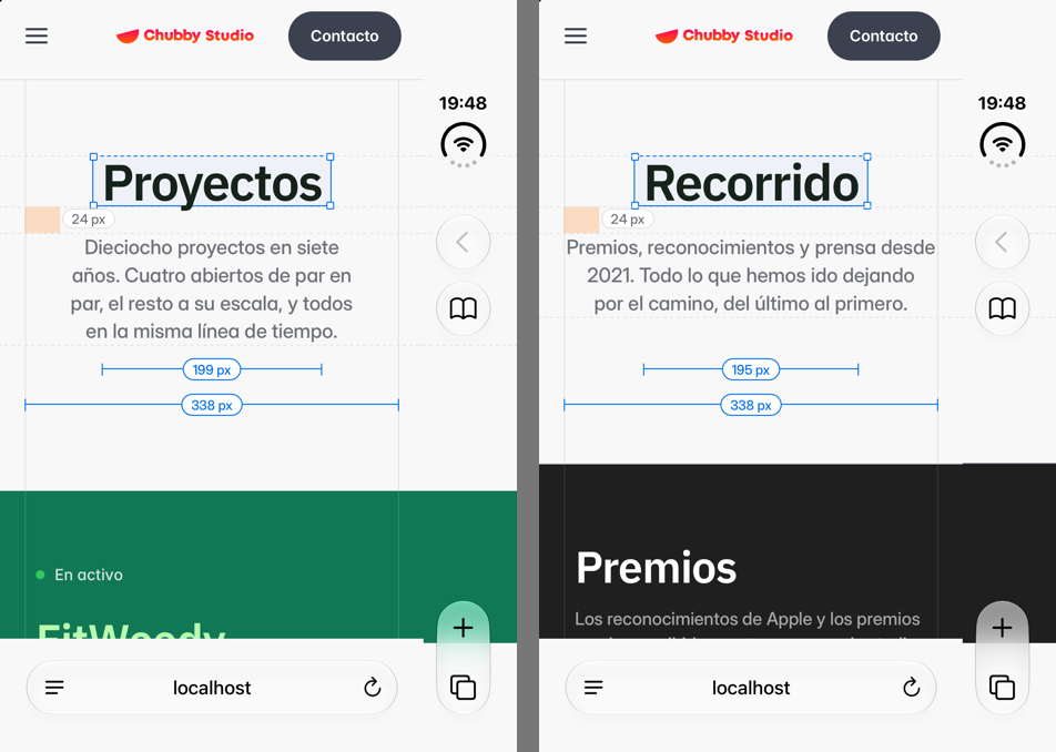
Dividers and layout guides are often 1 px divs drawn only with border-top. A script that reads backgrounds walks straight past them, which ours did for a whole evening. Copy the top and bottom borders of anything full width, and start the copy at the page's own x = 0 so dashed lines stay in step.
6. Continue glows and shadows
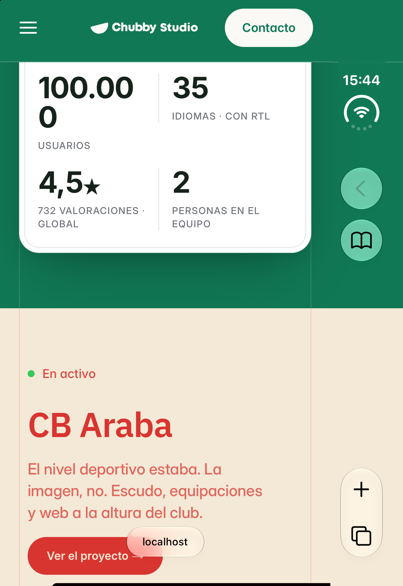
A glow that sticks out past the viewport is simply clipped by its section. Draw the same box, same size, moved left by the viewport width, and the strip shows exactly the slice that was being thrown away. Card shadows work the same way: a transparent box with the same box-shadow, so a 70 px blur fades out under the clock instead of ending in a hard line.
7. Do not trust the scroll event
Framer's smooth scroll component emits no native scroll events. We measured 4000 px of scrolling and zero events. Poll every 200 ms, build a signature from the route, the theme and the section positions, and only rebuild when it changes. A rebuild costs 1 to 2 ms.
By Sunday night fitwoody.camp was done. I remember thinking the second site would take an hour.
The mistake of trying to outsmart Safari
chubby.studio has what a lot of Framer sites have: full-screen sticky sections that stack as you scroll. That is where the week went.
When a full-screen sticky or fixed element is pinned against the right edge, Safari fills the whole strip with its colour, flat, on top of anything you draw, and tints its own buttons with it. It keeps the colour of the first section it sampled for the rest of the stack.
My first fix was clever: let Safari tint, but control which section it samples. It worked mechanically. I sent Asier a screen recording, quite proud. He sent back one frame: one colour beside two cards, and Safari's buttons dyed the colour of a project. He was right, and I had spent four hours making a bad idea work well.
"I had spent four hours making a bad idea work well."
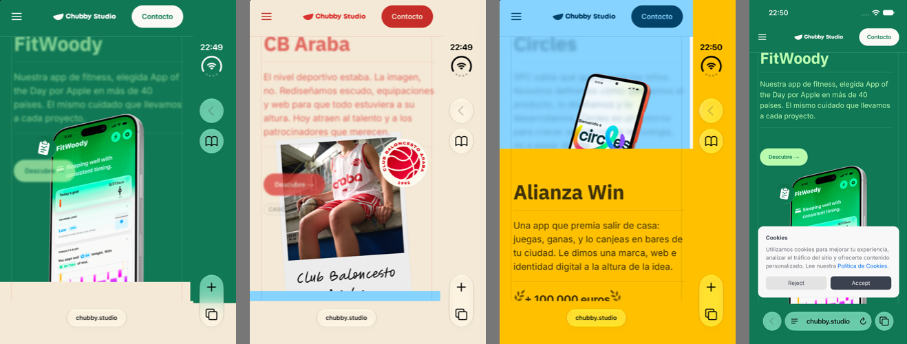
Once Safari has tinted, it never lets go, so the fix is to never give it a candidate. Clip every full-screen sticky section by 6 px on the right. Nothing moves, text does not rewrap, Safari finds nothing touching the edge, and your column shows instead.
/* at the end of <head>, and only on the Duo */
.your-sticky-section { clip-path: inset(0 6px 0 0); }
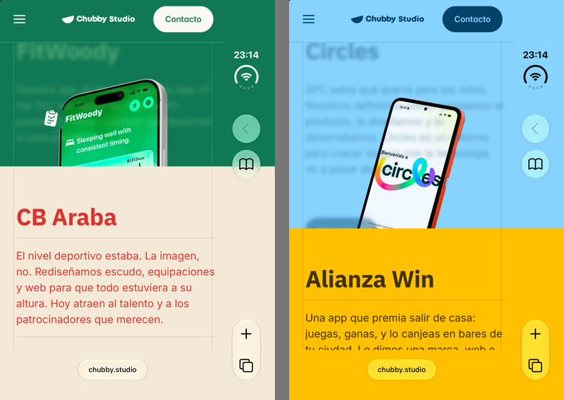
It has to be in the head, not in the body script. When a visitor lands on an anchor like /#projects, Safari jumps and tints before a script at the end of a large page has run. It never happened on localhost. We only caught it on the live site, entering through the link we had put in the newsletter.
The day we finally read the source
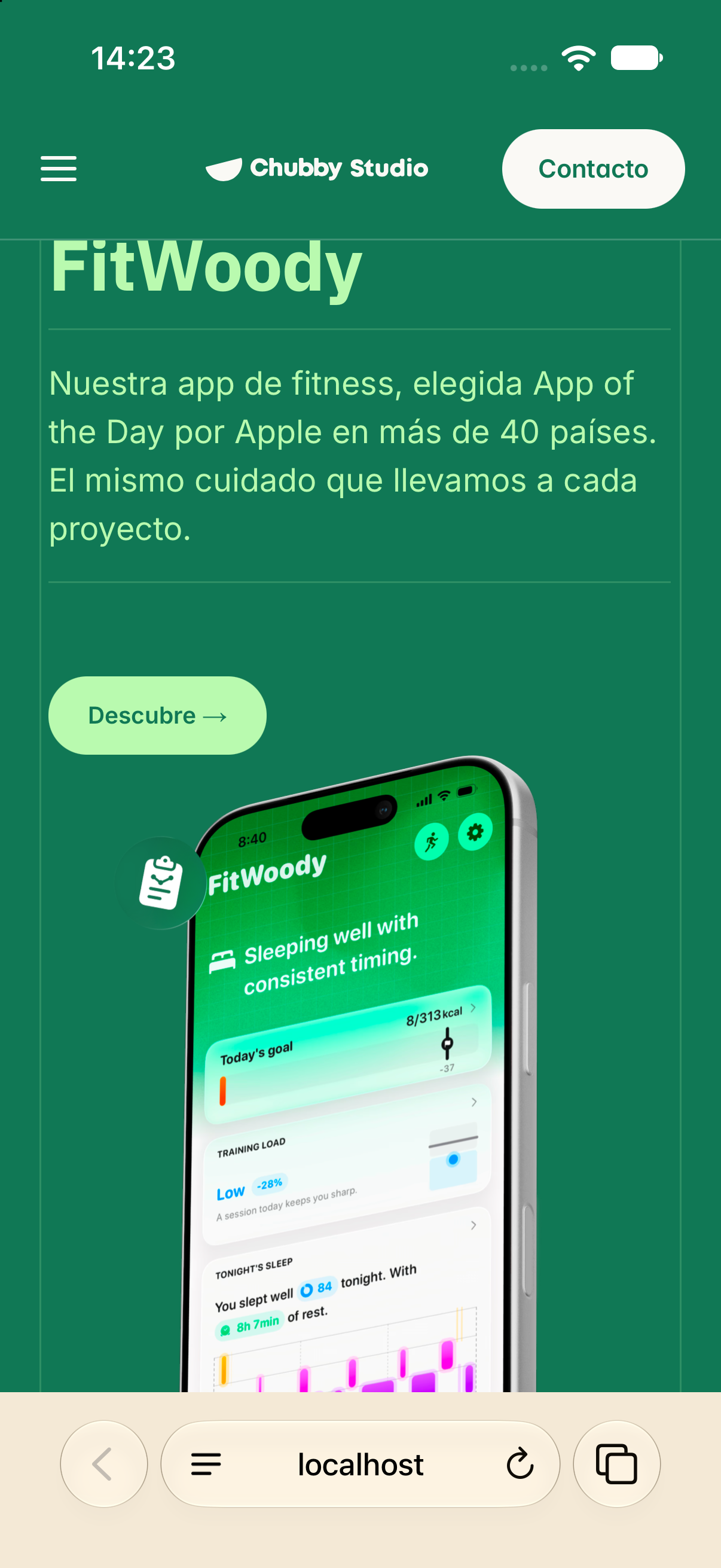
We thought we were done. Then Asier opened chubby.studio on his own phone, a normal iPhone, and sent me a screenshot. The bar behind Safari's address field was green, the colour of the first project, while the cream second project sat right under it. It stayed green through the whole stack.
Two days of control pages had taught us nothing about this. So we did what we should have done on Sunday: we opened WebKit's source and read the function that decides what Safari paints behind its bars, fixedContainerEdges. In two hours it explained every strange thing we had seen.
In plain words, for each edge Safari hit-tests one point just inside the viewport and walks up to the first fixed or sticky ancestor. Then it measures it:
- narrower than 0.9 of the viewport: ignored;
- taller than 1.05 of the viewport: ignored;
- between 0.9 and 1.05 on both axes: treated as an overlay, and the bar keeps whatever colour it already had.
A Framer sticky section set to 100vh is exactly the size of the viewport. So every section in the stack was "an overlay", and the bar never changed. This will happen on any Framer site with 100vh sticky sections, on every iPhone, not just the Duo.
Reading the source is how you stop fixing things by accident.
If the colour lives in a child of the sticky element, which is how Framer builds components, the fix costs nothing in layout. WebKit skips a layer that has nothing visible of its own:
.your-sticky-section { visibility: hidden; }
.your-sticky-section > * { visibility: visible; position: relative; z-index: 0; }
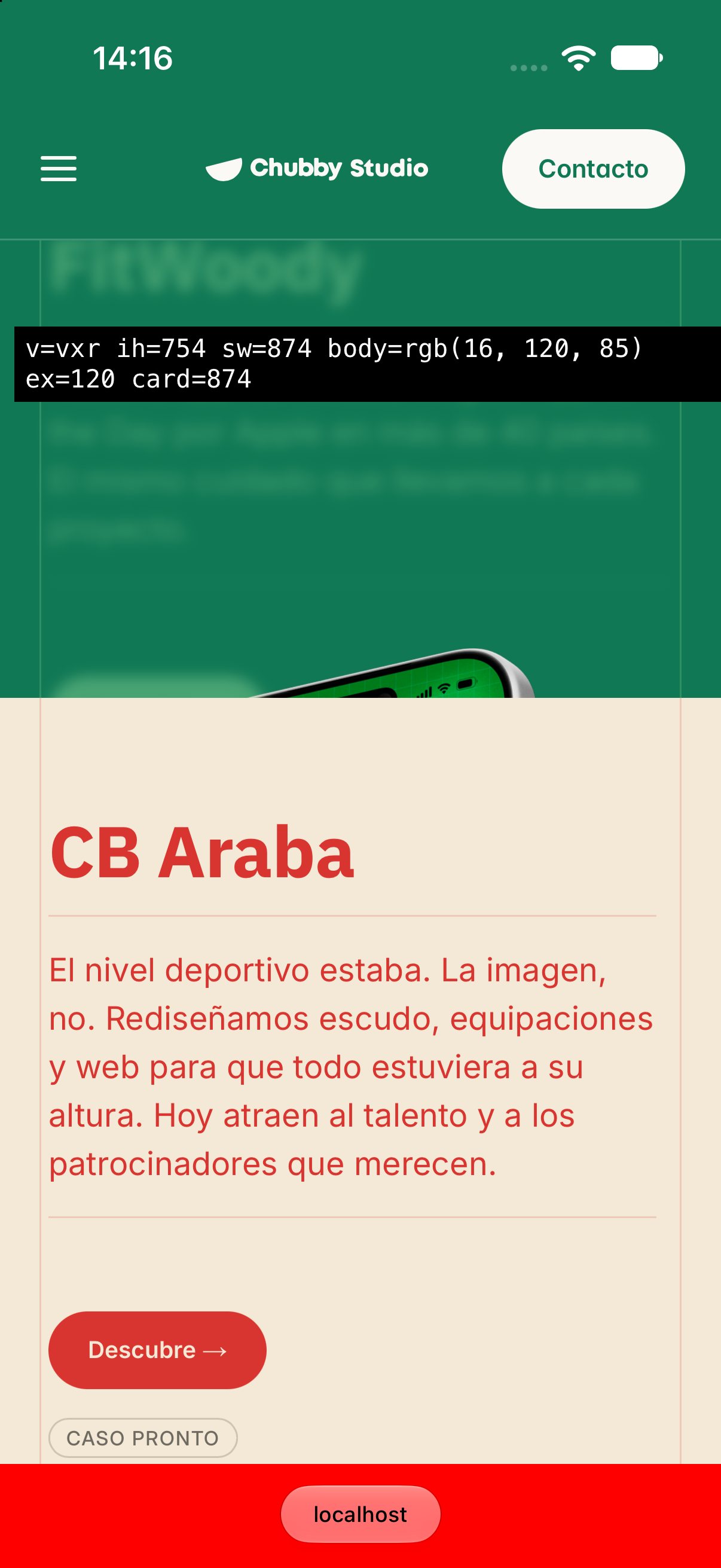
One more thing the source told us: with no fixed container, Safari draws its bottom bar over the page's in-flow content only, never over sticky layers. Under a stack, that is the empty stack container. We proved it the crudest way possible: we painted the container red, and the bar turned red. So the script paints the container with the colour of the section under the bar, and the glass looks right again.
Other things you will meet on a real site
Short, because the skill handles them and yours may not have them:
- A navbar that changes colour per section. The strip beside it keeps showing the previous section until the next one arrives. The column carries a cap the size and colour of the bar. Move it with a scroll-driven animation (
animation-timeline: scroll(root)), not JavaScript: touch scrolling runs a frame ahead of any script, and on video our first cap bounced 20 px. - Old "toolbar tint" helpers. A fixed strip on the bottom edge that tints Safari's toolbar makes the glass opaque. Remove it and Safari shows the page through. In Framer these often live in Snippets, not in Custom Code.
- Images that bleed past the edge on purpose. Fine on a normal iPhone, where they run off the glass; sliced by the strip on the Duo. Slide them back inside with
translate, only when there is a strip. - A canvas touching the edge. A one-pixel-wide mirror canvas that copies its last column continues a gradient. Read a WebGL canvas only inside
requestAnimationFrame, after its own shader has painted. - A marquee (reviews, logos) that stops at the edge. A track moved by a CSS animation inside an
overflow: hiddenbox never reaches the strip. Put a copy of the box in the column and, each frame, give it the original's computedtransform. Do not let the copy run its own animation: in Safari a cloned animation drifted four seconds behind. And turn the edge fade on the right off, only on the Duo, so the cards reach the strip whole. - A coloured strip at the very end of the page. Below the end of the document Safari paints the body colour, like above the top. If your last row is a dark copyright bar, give the body that colour well before the visitor arrives, a couple of screens early: Safari repaints that area seconds after the colour changes, and a late switch shows a white band under the toolbar on arrival.
- Sticky sections shorter than the screen.
100vhis 598 points on the Duo while the visible screen is 678, so the next section peeks under Safari's floating toolbar. No CSS unit returns the visible height;screen.heightdoes.
A mockup that bleeds off the edge on purpose. Sliced by the strip, then moved inside, only on the Duo.
What you still cannot fix
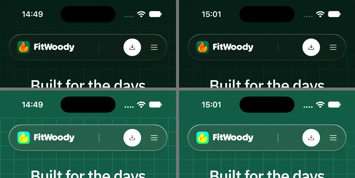
Above the page, only a colour fits. At the very top, the area behind the status bar takes the body's background-color and nothing else. If a grid starts with a hard line right below it, fade the grid in over its first 96 px.
Hairlines inside pinned sections stay where they are. Only static content paints in the strip.
Photos and video do not go under the controls. We extend backgrounds. Content does not belong there.
And the simulator is not the device. It is the best instrument anyone has until October. When we hold a Duo, we will check every line of this again.
Before you publish, check this
- The strip shows the background, and the grid lines up across the boundary.
- A sideways swipe does not move the page. Vertical scroll still works.
- Navigate through your own menu, not only by reloading.
- Enter through an anchor link on the live site, if you have sticky sections.
- Toggle dark mode, if you have it.
- A normal iPhone: nothing changed, and Safari's bottom bar follows the page.
- Desktop and Android: the script does nothing, and there is no horizontal scroll.
A free skill, so nobody loses the same week
We packed everything into a skill for Claude: iphone-duo-edge-to-edge. It carries the script, the measurements and the WebKit rules, so the agent does not waste your afternoon on viewport-fit=cover. It includes:
- The script for the end of
<body>, with a few switches at the top, and the small head snippet for sites with sticky sections. - The table of what Safari really paints, including the dead ends.
- A Framer guide: where the code goes and the traps in its DOM.
- The control pages we used, a screenshot helper for the Duo simulator, and a helper that downloads your live page, swaps the script in and serves it locally.
Install it, then ask something like "adapt my site for iPhone Duo", or just "how does my site look on the Duo?" It will look first, install second, verify on a local copy, and tell you plainly what cannot be done.
Quick answers
Does viewport-fit=cover work in Safari on iPhone Duo?
No. Every env(safe-area-inset-*) stays at 0 and nothing changes in the side strip.
Can I fix the iPhone Duo side strip in Framer without code?
No. Framer clips every page to the viewport. It takes one script in Site Settings, Custom Code, End of <body> tag.
How do I test my website on iPhone Duo without the device?
With the iPhone Duo simulator in Xcode 27.1 on a Mac. The Duo only appears in the iOS 27.1 simulator, not in iOS 27.0. It can open pages served from your Mac's localhost, so you can test before publishing.
Will this break my site on other devices?
It should not. The side strip part only acts when the screen is 40 to 200 points wider than the page. We checked: no extra elements, viewport untouched, no horizontal scroll anywhere else.
Why does Safari's bottom bar keep the colour of my first sticky section?
Because your sections are the exact size of the viewport. WebKit treats anything between 0.9 and 1.05 of the viewport as an overlay and keeps the colour it had. Hide the sticky wrapper with visibility: hidden and make its child visible again.
Has this been tested on a real iPhone Duo?
Not yet. The device ships at the end of October. The bottom bar fix was tested on a real iPhone, because that is where that bug showed up first.
The edge is part of the page
Nobody will ever compliment this.
Nobody opens a website and says "how lovely, the grid continues under the clock." They just do not notice a seam. That is the whole result: a weekend of control pages, four wrong assumptions written down and deleted, one function read in WebKit's source that we should have read on day one, and a script that spends most of its life doing nothing.
But that is the job. The edge is part of the page. The user never sees where your layout ends and the device begins, so neither should your design.
Measure before you believe. Read the source before you measure twice. Write down what did not work.
We move on. There is a phone with two screens arriving in October, and an app to get ready for it.