I Can't Animate, So I Made a Film With Claude
I can't animate. I still made FitWoody's film in a day and a half, with Claude writing the code and me saying "no, again" about fifty times. How it went, what broke, and why the prompt was the least important part.

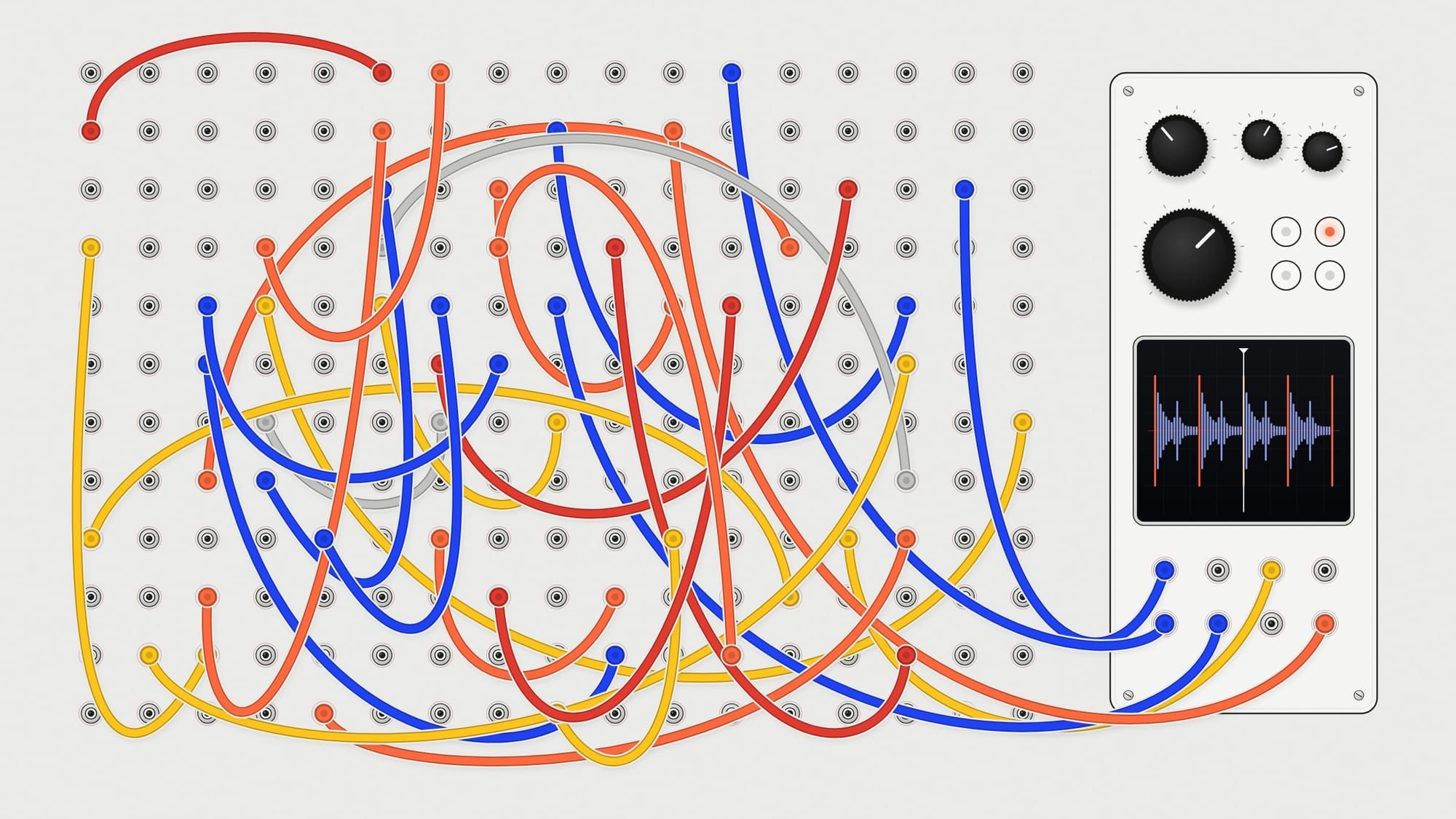
Okay, so. Every year we put FitWoody forward for a design award, and this year they asked for a video. Two minutes max, in English. Here it is:
I posted it on Twitter and my DMs went a bit crazy. Most of you asked me some version of the same thing: "what prompt did you use?" So let me tell you how it actually went, because the real answer is a lot less magical and, I think, a lot more useful.
Wow esto con Remotion? Lo uso semanalmente, pero con prompts concretos? Porque la calidad me parece una locura
— Felipe Cardona (@_felipe_cardona) September 22, 2026
A bit of context
I love motion. I always have. In our apps we're constantly fiddling with little animations, how a card lands, how a number counts up. But a proper video, the kind where the type comes in right on the beat? That had been on my "one day" list for years. I never had the time, and to be honest, I never really felt like sitting down to learn it from zero either.
The app footage wasn't the problem. I record FitWoody with Matte, the phone floating in 3D with the real screens, and I've been doing that for the website for a while. What I didn't have was everything around it.
So on Monday morning, at 9:42, I asked Claude if there was any tool that could help me with the animations. And I added that here, it really, really had to look good. It said Remotion. Remotion makes videos out of code, in React. I don't write React. Claude does. So that was the deal: I'd bring the recordings and the eye, and it would bring the hands.
The first version
It showed up really fast. All the scenes, in order, with their texts. Technically, perfect.
I watched it and felt absolutely nothing.
It opened on a black screen with numbers floating around. The text came in spinning like a little roulette wheel (why??). There were cards in every colour of the rainbow, every screen sat there forever, and the music was pure YouTube tutorial. And my favourite: in one scene the iPhone had a ring. FitWoody doesn't have a ring. Claude made it up, and it looked so real that I actually stopped for a second and thought, wait, do we?
Top: Monday's first version. Bottom: the final one.
Looking back, that one was half on me. I'd asked for "a film" and I got a film, as fast as possible. So I told it we were going way too fast, that we had to slow down and go scene by scene. And we started over.
Not that it was smooth sailing after that. By mid-morning I'd already hit my usage limit and had to wait for it to reset. And in the afternoon, right in the middle of rendering the passport scene, my Mac just froze. Completely. Lesson learned: one render at a time.
What actually changed things
It wasn't a clever prompt. It was a message I wrote without thinking too much, listing what I wanted. Only three backgrounds: white with the grid, the very dark green, or the night sky for sleep. Text in grey, with the important word in black. Orange only when something really matters, and almost never. The colour comes from the app, not from the video. And no AI-generated footage, because it looks like cardboard.
Which is basically our website. I'd just never had to put it into words for anyone.
After that message, Claude never suggested a coloured background again.
The same scene, before and after I wrote down the rules.
Then came the music, which I explained terribly. I wanted less melody and more punch, a pum pum pum, strong and steady. (Yes, I really wrote "pum pum".) We ended up with a stomp-and-claps track, and that's when Claude did something I'd never have thought of: it stopped counting the video in seconds and started counting it in beats. Every scene starts on a beat. Every headline lands on one. The night falls right when the music drops.
And that's when it clicked for me. I've spent my whole life lining things up on a grid. This was the same thing, only in time instead of space. Suddenly motion felt like something I knew how to do.
Scene by scene
From there it was a loop. Claude made a scene, I watched it twice at full screen, and I sent notes, usually with a screenshot of the exact frame that was bugging me. When it was nearly there, I asked "what would you improve?" and it came back with a list. I'd answer "do all of them", or "all except number four", or "fine, but no colour".
The night scene went through eight versions. The desk with all the devices, another eight.
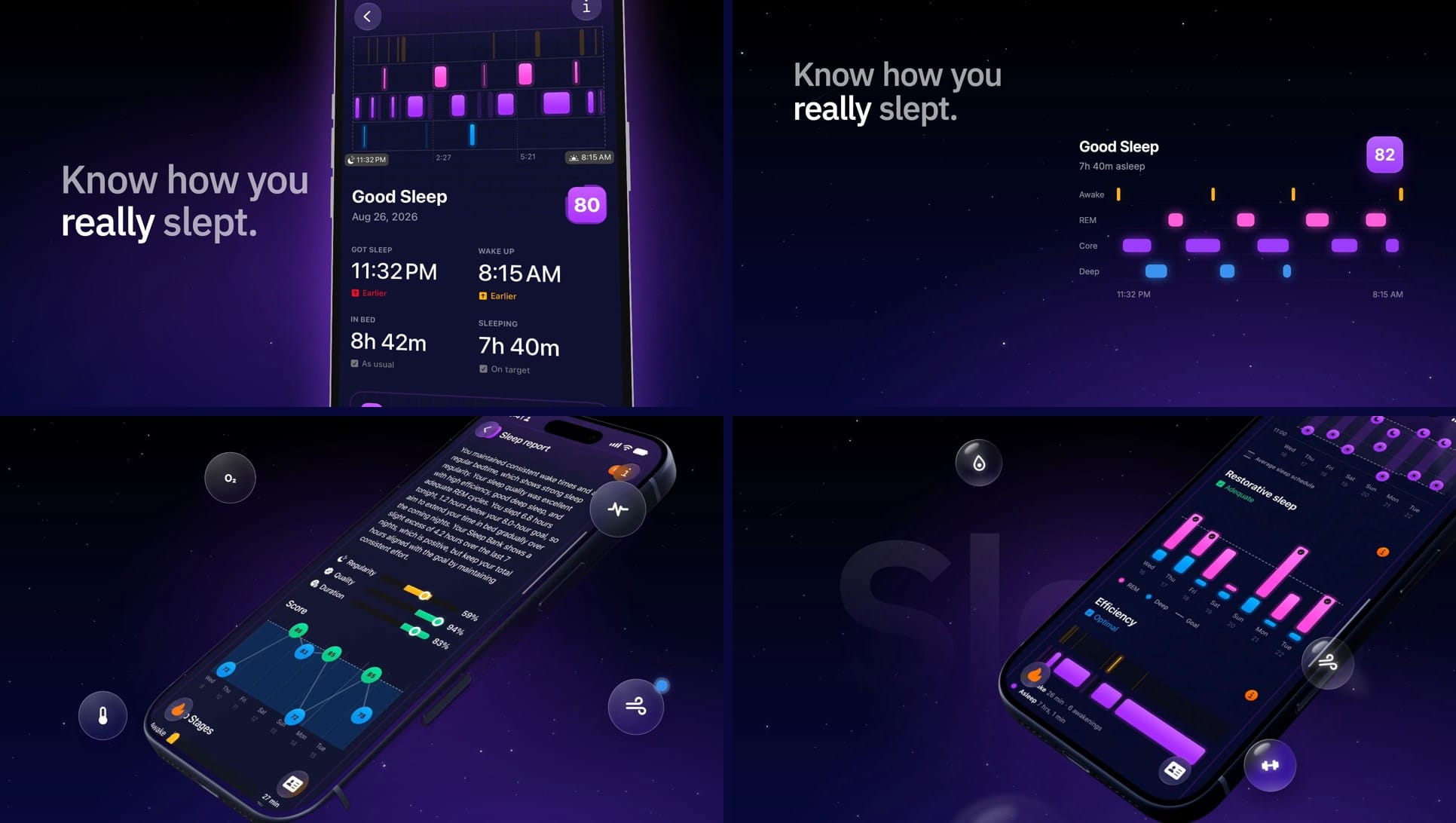
The funniest part was seeing how differently we understood "done". The last scene is a desk from above: the Mac, the iPad, the iPhone, the watch and a cup of coffee drop onto the table one by one. Claude gave them a little physical bounce when they land. By the numbers, perfect. On screen, the Mac was shaking like there was an earthquake, and that's literally what I wrote back. Turns out the bounce was moving everything a fraction of a pixel on every frame. Totally correct, totally horrible. We took it out, stopped the camera, and the Mac finally sat still.
Top: the earthquake. Bottom: the Mac, finally still. Look at the keyboard.
That kept happening. A sleep badge that wasn't quite square. A blur sitting on top of the phone instead of behind it. Bubbles that weren't fancy enough, and then got colour, which I didn't want either. And ideas that sounded great in words and that I hated the second I saw them move: measurement lines around the phone, the interface split into floating layers (that one was mine, I'll own it), a mirrored version for Arabic.
I ended up kind of loving that part. Claude can check that everything is exactly where it should be. Whether it looks good, I had to decide every single time.
Oh, and the film was allowed to run two minutes, but a few scenes were just sitting there waiting for the music to catch up. I'd rather have it shorter, so it's 1:43.
If you want to try it
What I'd do again:
- Pick the music first. It decides how long everything lasts.
- Write your rules down on day one: backgrounds, colours, type. Three lines is plenty.
- Send references, and say what you like about each one. "Make it prettier" doesn't work with a person, and it doesn't work with an AI.
- Use your real screens and your own recordings.
- When a scene is nearly there, ask "what would you improve?"
- Watch everything full size. More than once.
The whole thing took a day and a half. Asier tweeted that if you give me a Max plan I start throwing sparks. I think it's more that, for once, I had someone who knows the tool inside out and never got tired of me saying "no, again".
The images for the award, by the way, I made myself. In Figma. The old way.